
You can build 90% of an LLM feature in an afternoon. You write a prompt, point it at a good model, and it works. Good enough to demo the same day, good enough to be excited by how strong it already looks.
The other 10% is the entire job: turning something that looks good into something you'd bet on.
That last part is the difference between "the demo worked" and "we are confident enough to put this in front of millions of people, and we can keep making it better without guessing." Closing the gap took us a few weeks per feature, and almost none of that time was spent on the prompt or the code. It was spent answering one question over and over: how do we know this is actually good?
This is a post about two photo Tinder® features we built on our team (Photo Feedback and a hybrid Smart Photo ordering model), and what it actually took to get them there.
Two things mattered more than anything else. First, start from the product and the user's pain, because that's what tells you which engineering judgment calls are even the right ones. Second, everything after that hinges on whether you have ground truth and if you don't, your first job is to manufacture it.
Start with the pain, not the model
It's tempting to start an LLM project from the model: here's this powerful thing, what can we point it at? That's backwards, and the difference shows up later as a hundred small judgment calls you have no principled way to make.
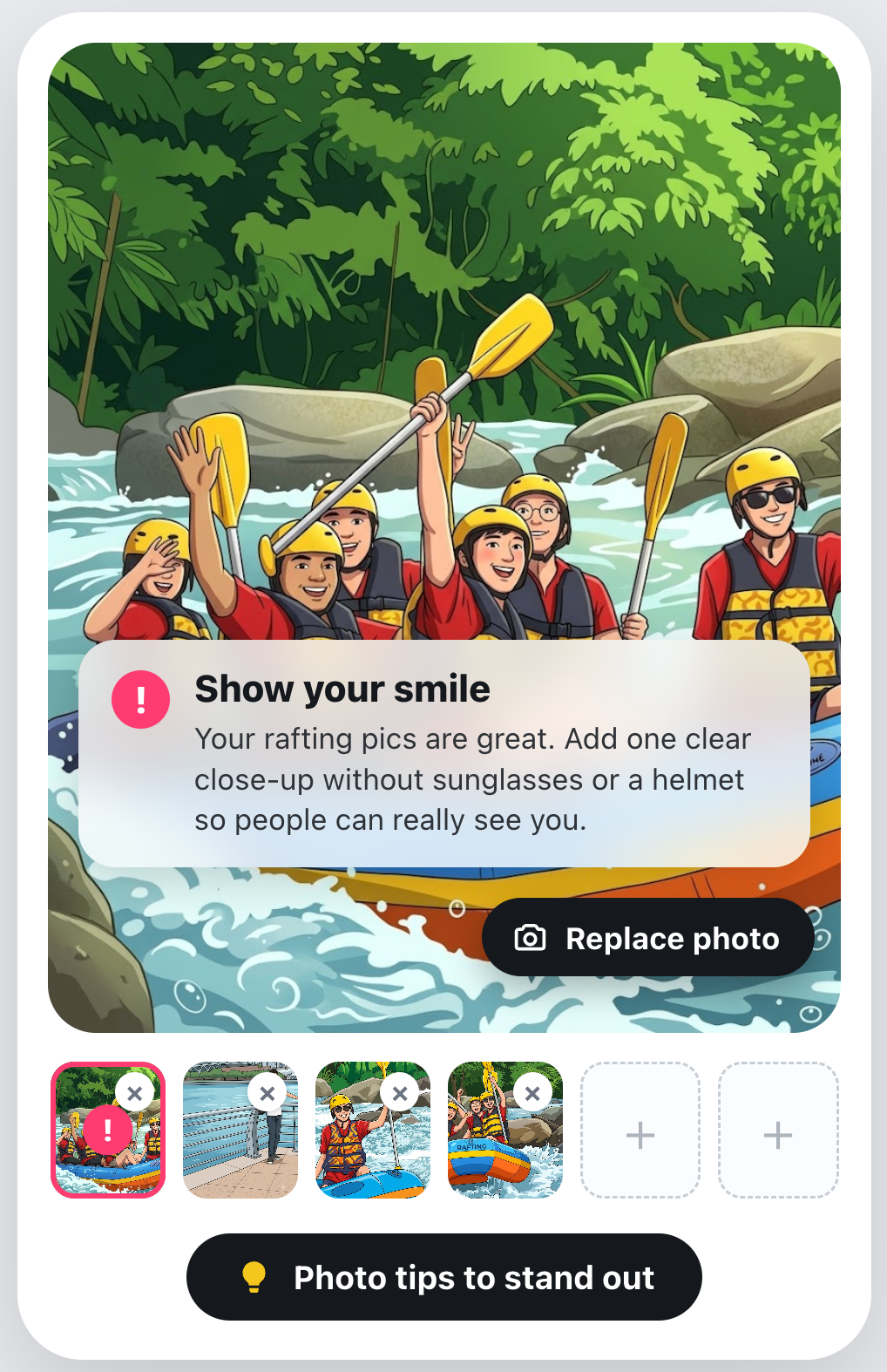
Photo Feedback started from a user problem. A large share of new users never get traction in their first week, and we know photos are the single biggest lever on whether someone has a good experience. So we asked a very human question: what would the best possible version of this look like if we weren't constrained by scale?
The answer is obvious if you've ever gotten ready for a first date. Nobody rolls out of bed and walks out the door. You pick the outfit, you fix your hair, you maybe text a friend a couple of photos and ask which one's better. A good profile is the digital version of that: not a fake version of you, the best version of you. What every user really wants is a thoughtful friend or a great dating coach who looks at all their photos, reads their bio, and says "this one isn't doing you any favors, and here's what would work better for you specifically."
In practice, that sounds like:
"Your bio about solo traveling is awesome. Add a photo of you doing something in Thailand, like street food or a beach, for an easy conversation starter."
"You come across as warm and fun. A relaxed photo with friends would make it even easier to picture hanging out with you."
You can't hire a coach for millions of people. Now, with an LLM, you can do the next best thing. And this is the principle that ended up steering most of our decisions:
The role of AI here is not to act for people. It's to remove the barriers that stop people from being the best version of themselves. We're saying: your photos could tell a better story about who you are, and here's how.
That sounds like a values statement, and it is, but it's also a design spec. Once you take it seriously, the hard product calls answer themselves:
- We optimize for precision over recall (more on this below) because the moment we tell someone a genuinely good photo is bad, we've broken trust and become the opposite of a supportive friend.
- The tone is non-negotiable: light, specific, warm, never a judge. A coach who makes you feel worse isn't a coach.
- We never penalize someone's intent. An artistic silhouette, a photo with their dog, a shot in front of a helicopter: these aren't "bad lighting" or "distracting backgrounds." They're someone showing you who they are. A model that flags them is wrong about the product, even if it's right about the rubric.
None of those are model decisions. They're product decisions, and we could only make them confidently because we'd been clear about whose pain we were solving and how. The model is the engine. The product understanding is the steering.
Do you have ground truth?
Here's the fork in the road for any LLM feature. Before you tune a single prompt, ask: is there an objective signal I can score the model against? The honest answer changes how you build everything that follows. We built both kinds of features, so we got to live on both sides of the fork.
When you have it: Smart Photo ordering
Smart Photo is the easy case. The model picks which photo, shown first, earns the most attention, and like rates from real member actions say whether it got it right. So the eval loop is boring on purpose: run the model over thousands of photo pairs, score it against the actual like rates, fix what's wrong, repeat until you plateau.
Just because you have clear ground truth does not mean your model will perform well against it. The LLM, tuned and re-tuned, topped out in the low-60s on pairwise accuracy; the existing production model, a vision model purpose-built for exactly this, was already in the mid-70s. Clean ground truth, but also clean verdict: we did not beat the specialist model at the one thing it was built for.
But the same evals showed why, and pointed somewhere new. The LLM wasn't really picking the single best photo; it was reasoning about the whole profile, the order and story across every shot, which a pairwise score can't even see. So we stopped competing and combined the two: the specialist model picks the all-important first photo, the LLM sequences the rest. We tested exactly that, but the live experiment proved the lift wasn't enough, so we dropped it.
This stung. The offline numbers had moved and the idea was elegant. But it's also the most useful thing in this post: an offline number is a hypothesis, the live experiment is the verdict, and when they disagree, the experiment wins. The discipline to kill an idea cleanly is the same one that ships the winners with conviction.
When you don't: manufacturing it for Photo Feedback
Photo Feedback is the harder case because there's no objective measurement of a good dating photo. Whether a photo works depends on your other photos, your bio, your style, the story you're telling. This kind of judgment is a great fit for an LLM. But to know whether its judgments are any good, you need something to grade them against.
We had nothing objective, so we built it ourselves. We had folks on our team rate a few hundred photos each, one to five, and a majority vote consensus turned their opinions into thousands of good/bad labels.
Then, before we let those labels grade the model, we did the step almost everyone skips: we checked whether the raters agreed with each other. On a plain good-or-bad call, humans only agreed about 60% of the time.
If careful humans only agree 60% of the time, then 60% is the best the task allows. A model that matches human consensus as often as humans agree with each other is already as good as the problem lets it be. Human judgment is a ceiling here.
The ceiling also forced a product choice. We couldn't push raw accuracy much higher, so we had to decide which kind of trade off to make:
- Precision: when we call a photo bad, are we right?
- Recall: of the bad photos, how many do we catch?
We chose precision decisively, because that's what makes sense for the product. Tell someone a good photo is bad and you've broken trust, and they stop listening to the product after. Missing a weak photo is fine (and since humans only agree 60% of the time, the photo might not actually be weak). So we aimed for high precision and accepted low recall.

The metric tells you the score; the visualization tells you why
Tracking precision and recall moved us in the right direction, but the numbers alone were not enough. "Precision is 74%" tells you where you are. It tells you nothing about what to fix.
The breakthrough was building a diagnostic error report for every eval run: a page that showed every single human-LLM disagreement, with the actual photo, the model's score, each rater's score, and, crucially, the model's own internal reason for its call. Suddenly the failures had faces, and the patterns were obvious:
- Artistic photos (silhouettes, dramatic angles) got called "bad lighting" because the model followed the rubric too literally, when humans just saw a cool photo
- Pet photos got flagged for "no face visible," when our policy explicitly says a dog is a perfectly good lifestyle photo
- Unique experiences (helicopters, concerts, hikes) got dinged for "distracting background," when those are the best conversation starters a profile can have
No amount of staring at a precision number would ever have surfaced "the model has a vendetta against helicopters." We only found it by looking. Once we could see the patterns, we generalized them back into the prompt, and on the strongest days we ran several prompt iterations in a single day: see a pattern, fix the prompt, re-run, check. That's the loop, and it only exists if you build the tool that lets you look at the actual outputs instead of just counting them.
If your benchmark is noisy and your task is subjective, the single highest-leverage thing you can build is a better way to visualize the errors.
Show the model, don't tell it
The hardest part of Photo Feedback wasn't deciding which photo to coach on. It was this question: how do you tell someone their photo isn't great without making them feel bad? And tone, for a feature like this, is the product. The same recommendation can land as a warm nudge from a friend or as a cold verdict from a judge, and the difference is the entire experience.
Our first instinct was to describe the tone we wanted. We wrote careful instructions: "Be empathetic and specific," "emphasize competence," "frame for growth." The output was... fine. Generic-fine. The kind of text that's technically on-brief and totally forgettable.
What actually worked was showing instead of telling. We gave the model a small set of worked examples (good coaching for a genuinely bad photo, for an average photo, for an unflattering angle) covering the common cases plus the tricky edge cases. Fewer than ten of them. And the model immediately got it, in a way that paragraphs of description never achieved.
This is the few-shot pattern, and it's worth saying plainly: for anything where tone is part of the product, examples beat descriptions, and few-shot beats zero-shot, reliably. A description tells the model what category of thing you want. An example shows it the thing. When the target is a specific voice (light, warm, optional, never directive), that gap is enormous.
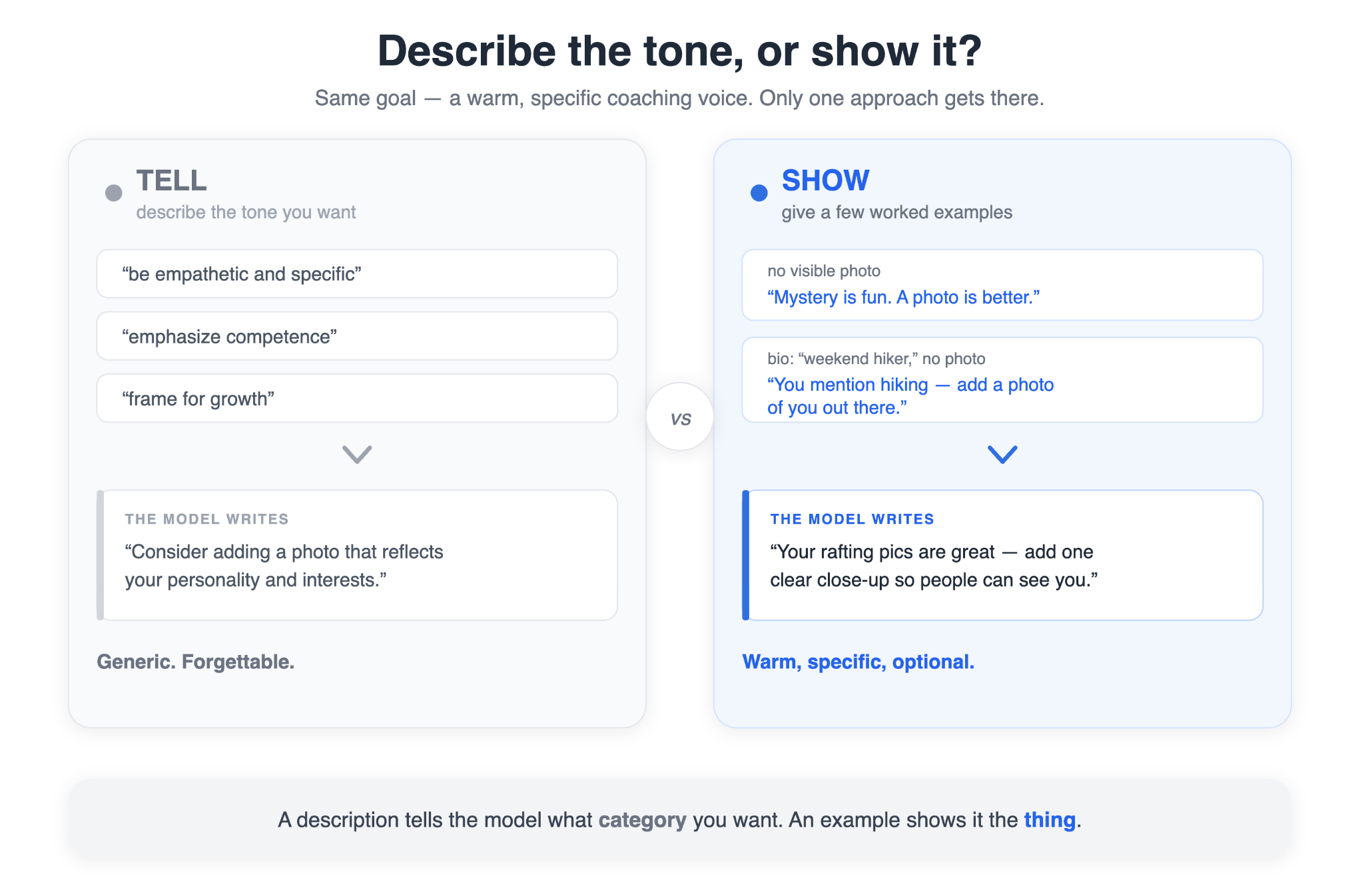
A couple of the examples that anchor the voice:
- Context: The photo has no visible content. Example: "Mystery is fun. A photo is better. Upload one that shows who you are."
- Context: Bio says "weekend hiker," but no photo shows it. Example: "You mention hiking. A photo of you out there could be an easy conversation starter."
Let the model be exhaustive; let code be selective
The pattern that served us well for this product: let the LLM be exhaustive, and let code be selective. We tell the model to give us everything—every photo, every duplicate, every category gap. Then deterministic backend logic decides what's actually worth showing the user, dropping anything below a confidence threshold, never suggesting we remove someone's only face photo, protecting the stronger of two similar shots. Same model output plus same config produces the same final suggestions, every time. The model handles subjective judgment; code handles policy, and each is independently tunable, so we can change what we say without re-litigating how the model thinks.
Concretely, that policy layer is just a config object, so tuning the product is a code change, not a prompt change:

Want more suggestions, or fewer? A stricter bar for one audience than another? Each is a line in this config, with the prompt and the model left untouched.
We separate the internal assessment (blunt and diagnostic, for our logging and decisioning) from the user-facing text (always the warm, validate-then-suggest version), and the model never copies one into the other. It judges frankly in private and speaks kindly in public: thorough and gentle at the same time.
The most underrated tool in LLM engineering: prompt caching
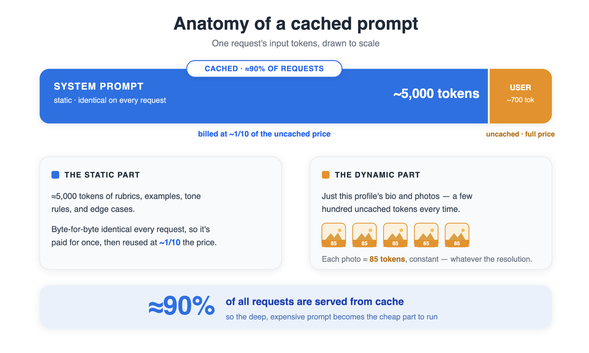
A reliable LLM product usually pushes you toward a bigger, deeper system prompt: more rubrics, more examples, more edge cases handled explicitly, so the model does not have to guess. That is how you get consistent output. But a 5,000-token system prompt, run on every profile across millions of users, sounds financially absurd.
It is not. It cost us significantly less than you would expect, because of prompt caching.
And it's worth pausing on that name, because "prompt caching" undersells what's happening, and this makes people afraid of big prompts. Let's go a layer deeper.
Prompt caching is not just a key-value store attached to an API. When a model reads a prompt, it first does a prefill pass: every layer computes attention state for the input tokens, stored as the KV cache, short for key-value cache. That work is deterministic. The same tokens in the same order produce the same internal state every time.
So if every request starts with the same system prompt, the provider can compute that prefix once and reuse it on later requests. The model still does fresh work for newly appended user tokens. That live work is still billed normally. But the repeated static prefix is served from cache.
Keeping that cached state around requires some neat engineering. It is large, so it usually moves through a hierarchy: hot entries in GPU memory, cooler entries in host RAM, and long-tail entries on cheaper storage. That is what lets cached prefixes survive across many requests and users.
The result is what’s relevant to us: cached tokens are 10x cheaper than new ones. This is not a discount, it's just the provider passing through compute it didn't have to do.
Therefore, the naive way to cut costs would be to be stingy on the prompt or dropping examples. Prompt caching rewards the opposite. Put everything you need in the system prompt, and keep only dynamic, per-user data in the user prompt.
For us, the entire system prompt is identical on every request: every rubric, example, rule, and tone instruction. That entire block is cacheable. The only fresh tokens are the user’s photos and bio. One related trick keeps the image cost predictable: we pin every image to the provider’s low-detail setting—enough for the detailed review as confirmed in our evals, which gives each image a fixed token cost regardless of resolution.
The important point here isn't "bigger is better." It's that cost stops deciding how big your prompt gets. The evals decide that. You add what measurably helps, no more, and because each addition is static, it's priced once and pays off on every future request.
Caching makes a deep prompt affordable. Evals tell you which parts deserve to stay.
Together, they turn prompt engineering from vibes into a measurable hill climb:
- Add an instruction or example
- Run the eval
- Keep it if it improves results
- Cut it if it does not
Because every step is measured against ground truth, you can trust where you land.
That is the real power of prompt caching: it lets you build prompts based on reliability instead of fear of token cost. This isn't some vague thing you have to guess. OpenAI returns the prompt cache hit rate in their response and so you can track it in your dashboard. Ours is at about 93% cached.
From "it works" to "we'd bet on it"
Photo Feedback shipped globally. About 30% of users who saw it added or replaced a photo. The more telling part is the shape: the lift grew week over week instead of spiking and fading, the opposite of a novelty effect and the signal you most want to see. The same story held across a handful of independent engagement metrics: more replies, more contact exchanged, more people returning to the app, each up by low single digits and with statistical significance.
The hybrid Smart Photo work went the other way. A sound idea, tested cleanly on top of a strong existing model but the live experiment proved it wasn't worth shipping. The specialist model trained directly on like-rate ground truth, won. Making that call quickly based on data is the same discipline—win or lose, you decide with the confidence of clean results.
The outcomes are specific to these two features. What generalizes is the path to confidence, for any LLM feature you'll ever build:
- Start from the user's pain. It's what tells you which engineering judgment calls are the right ones. Precision over recall, tone as a first-class requirement, never penalizing intent: all of them fell out of being clear about who we were helping and how.
- Find out if you have ground truth. If you do, trust the numbers (even when they tell you to stop) and let them make you strategically smarter, not just locally better. If you don't, your real job is to manufacture it, and then to be honest about its ceiling.
- When the benchmark is noisy, build a way to see the errors, not just count them. The metric is the score; the visualization is the why.
- Show, don't tell. Examples convert a zero-shot problem into a few-shot one, and when tone is the product, that's the difference between forgettable and right.
- Understand your tools two layers deep. Prompt caching is what lets your system prompt be deep and rigorous, which is what lets your evals climb a hill worth climbing.
Anyone can get an LLM feature to "it works" in an afternoon. That's no longer the hard part, and honestly it's no longer the interesting part either.
The interesting part is getting to it works well, reliably, and in a way you'd put your name on. That takes real engineering work, and it doesn't come from a clever prompt. It comes from thinking differently, ground truth, the discipline to look at your failures, and the patience to keep climbing the hill until the number you trust stops moving.